

hedge21 -
a 21strategies brand
Our branding and identity.
Welcome to our brand design, a series of associated assets.
Using our brand design properly is very important to us. Our identity presents us
– to our clients, our team, our shareholders and candidates who join our firm.
This site contains everything you need to know about
how our brand design should be used in print and digital materials.
Our font style
For professional applications, such as in print media and on the internet, 21strategies’ typography
consists of the Barlow font family in the font versions light, semibold and bold: fonts.google.com/specimen/Barlow
headline
subheadline // introduction
PARAGRAPH TITLE
Two brands. One company.
Two versions of our identidy have been created -
one that represents our company 21strategies,
another to present our flagship product.
Our logos
Treat our logos well. They should not be altered.


Primary. Secondary. Colours.
Our primary colour palette underlines our visual brand and reflect our personality.
They are used to highlight information such as headlines or as background colour for important information.
Primary colours work best in small doses together with the secondary colours.
Secondary colours bring variety to the primary colours and can be used for both brands, 21strategies as well as hedge21.
Use dark grey instead of full black as the main text colour on a white and light grey background.
Otherwise, these colours should be used with consideration.


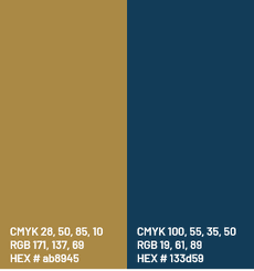
Our primary colors
When creating layouts for hedge21, use hedge21 »deep blue« instead of 21strategies' »gold« to highlight information.
Photography
Our photography style is clean, high-tech and authentic,
with a bluish touch.
It reflects the industry and our visionary ideas.

Fusing it all
When all components are being fused as one visual identity,
you should be able to recognize us.
Credits
Thilo Kirchner: MarCom design and creative partner
Tristan Boyd, markegy.at: Digital creative partner

LEGAL DISCLAIMER. This website and its associated documents (the “Website”) have been prepared by 21strategies GmbH and/or its affiliates ("21strategies") solely for information purposes with regard to their currency exposure related data product (the “Data Product”) and is being furnished through 21strategies solely for information purposes to assist the recipient in deciding whether to proceed with further analysis of the Data Product contemplated herein.
This Website is not a prospectus and does not constitute an offer or invitation or the solicitation of an offer for the sale or purchase of any assets or shares and shall not form the basis of, or constitute, any contract or binding offer. The information set out at this Website is preliminary and should not be relied upon for any purpose. Neither the receipt of this Website by any person, nor any information contained at this Website constitutes, or shall be relied upon as constituting, the giving of investment advice by 21strategies to any such person.
Recipients should conduct their own review and analysis of the Data Product, its vendor, prospects, results of operations and financial condition. Past performance
is not a guarantee of future results. Recipients should consider any procurement of the Data Product contemplated at this Website and its associated documents as a supplement to an overall
investment program.